To meddle or not: Considering redesign
Brands are forever innovating one or more of their product lines, reimagining their identities, or giving themselves an image overhaul. We at The Practice are all too familiar with this exciting process, having been at the helm of many successful design projects over the years. The past month has seen a number of brands take on imaginative (and not so imaginative) redesigns; today we consider three of November’s most talked about projects.
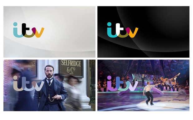
Just last week, ITV unveiled its new logo, establishing a reinvigorated brand identity alongside the removal of ‘1’ from its main channel. Part of the creative briefing was for the logo to mimic a handwritten style, and it also utilizes colours synonymous with the programmes it shows. What’s quite unique is that the logo colours change depending upon the programme being broadcast at the time. For example, it could change to green and purple while Dancing on Ice is being shown, or even transform to a palette of greens and browns to echo the jungle themes of I’m a Celebrity. The new design is part of the broadcasting corporation’s ‘transformation plan’ to cut costs and also reduce their dependence on advertising revenue. We like the idea of the changing colours, but aren’t too sure about the slightly more ‘childlike’ curvy font. The new logo will formally be used from January 2013 so we’ll have to wait and see if we’re persuaded!
The predicted look:
When it comes to redesigning a political campaign, factors such as the mood of the time, changed target demographic and socio-economic climate have to be considered. However we were left feeling slightly downtrodden after seeing the new branding for Obama’s 2012 campaign. Designer Josh Higgins who headed up the re-election campaign design team envisaged a new identity revolving around the classic blues, whites and reds of the Democrat party. It was a solid premise, but we at The Practice felt it lacked a sense of imagination inherent in Higgins’s non-official design work for Obama’s 2008 campaign in which he touched upon the ‘grass-roots’ feel of the political climate at the time.
But the rebrand that really made us do a double take this month was witnessing the new logo design born from the merging of Muller and Wiseman Dairies. If you haven’t seen this already, be prepared to splutter on your morning coffee:
We too thought our eyes were deceiving us when we saw this clearly embarrassingly lazy creation, described by Ronald Kers, CEO of Müller UK & Ireland Group, as an attempt to merge the heritage and ambition of both brands. If we’re not mistaken, the creators, (M3 Communications) have simply combined both existing logos together?!
And what about future redesigns? At The Practice we’ve been debating given ITV’s recent rebrand, whether the BBC could also greatly benefit from their own image overhaul in light of the Savile scandal? Can we really still trust that the world’s largest broadcasting corporation will continue to deliver its original mission to ‘inform, educate and entertain’? A renewed sense of trust in such a powerful conglomerate has got to be instilled, and we think that a rebrand might go some way in giving back the BBC a little credibility.
Have you been impressed by any recent branding efforts? And what do you think of the redesign attempts we’ve outlined above? (We do hope the Muller Wiseman Dairies logo is a joke!) We’d love to hear your thoughts so please tweet to and follow us @PracticeDigital and like us on Facebook.


