


iOS 7 unveiled…How do we rate it?
Like Marmite, or Margaret Thatcher, when a product, service or figure receives an overwhelmingly divided response, you know it’s going to be a talking point for a long time to come. And now, Apple’s latest offering, iOS 7, has achieved just that, especially amongst The Practice team!
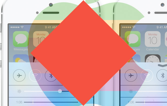
It was amidst a flurry of mixed opinion that saw Apple’s newest mobile operating system unveiled to the tech world at the Apple Worldwide Developers Conference in San Francisco. Described by CEO Tim Cook as the “biggest change” since the launch of the iPhone, iOS 7 incorporates a radical new design and features that place greater emphasis on multi-tasking.
First up, our take on the revamped design- and as designers, we at The Practice certainly had a lot to say on the subject! Having worked with Samsung in the past, we’re familiar with what constitutes a striking mobile interface, with clarity and consistency being two of the most important aspects to bear in mind. iOS 7 certainly delivers on this front, but where it falls short is its move away from Apple’s recognizable blueprint; now we’d challenge anyone to disagree that there are huge Android, Windows 8 and webOS influences. The new look is certainly cleaner, thanks to its “flatter” design, but will it fail to resonate with diehard iPhone fans?
Design chief, Jonathon Ive, said his intentions were to help “elevate” users’ content, particularly facilitated by the removal of real life textures such as wood and leather from apps- (skeuomorphism). We definitely like this move towards design modernity, and love the fact that that the wallpaper behind each icon is to have a parallex effect, meaning the phone will appear to have depth when moved. We were also excited to hear that the updated Control Center will now have a translucent overlay, which Ive states will aid “depth and vitality”, adding that even changing your wallpaper, for instance, will have “a very noticeable effect on the way your iPhone looks and feels across the entire system.” So for example, if we’re browsing our email, the phone’s environment will change to match the same colouring under the translucent panel. Sounds good to us!
And what about some of the new, notable features? We love that the new hub of the system will be The Control Center, easily used whilst on lock screen. It will feature a “pull-up tray” and tabs for quick access to your apps, even offering a flashlight, and enabling users to adjust brightness, volume and other settings without the need to visit the home screen. We also particularly love the system’s update to Safari tabs which can now be scrolled in a vertical carousel, allowing you to have as many as you want on the first page of your home screen, as opposed to just eight, as is the current set-up. Other updates we’re looking forward to trying include those to the camera app- now it will allow users to swipe between panorama and HDR, while photos will also be searchable based on date and location. All this, including more exciting new features including the long-awaited iTunes Radio, Siri and App store updates, mean we can’t wait to see the new system for ourselves when it launches this Autumn.
Love it or loathe it? And are there any new features you can’t wait to test out, or some which make you think- “Genius!” We’d love to hear your views, so please tweet them to us @PracticeDigital and share your opinions on our Facebook page.