Design takes over London!
Last week, The Practice team went to explore the different sites of London’s annual Design Festival. Starting off at the V&A and making our way to the Earl’s Court Exhibition centre and Tate Modern, we discovered an array of fantastic design work from all corners of the globe. Take a look at our journey in pictures…
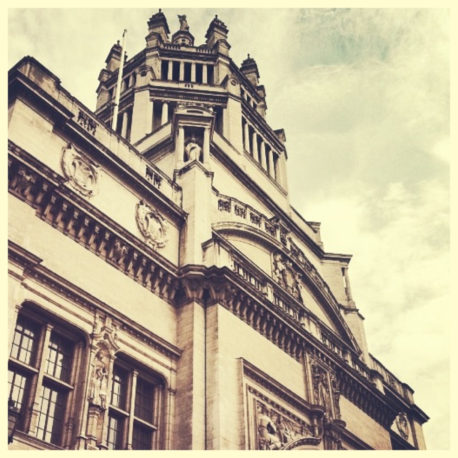
The Victoria and Albert Museum in all her glory, and one of the sites of the London Design Festival 2013:
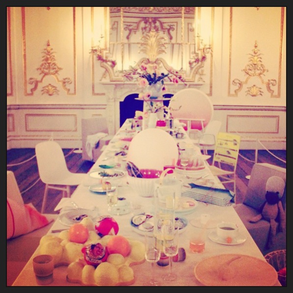
Inside, we saw true to life design project, “The Dinner Party”, created by duo Scholten and Baijing. The aim of the piece was to present objects in their natural surroundings, challenging the way we view art. The table was complete with oysters, fruit, half drunken cups of coffee, glasses, and chairs scattered at uneven angles:
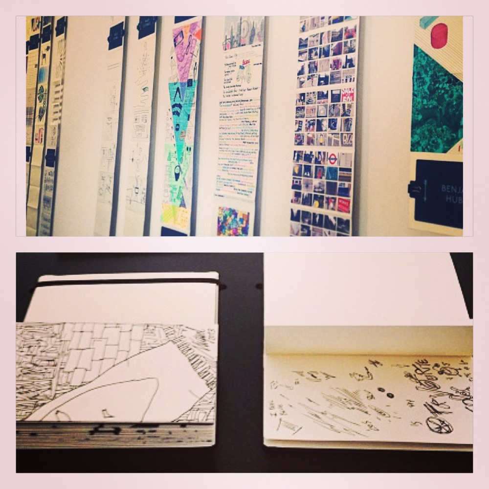
On to the British Galleries, where we saw Moleskine’s design project, The Sketch Relay, in which artists were asked to present illustrations based on three elements: the objects they couldn’t live without, inspiration from their personal and public lives, and something that they had always wanted to design but had never found the opportunity to yet. The results:
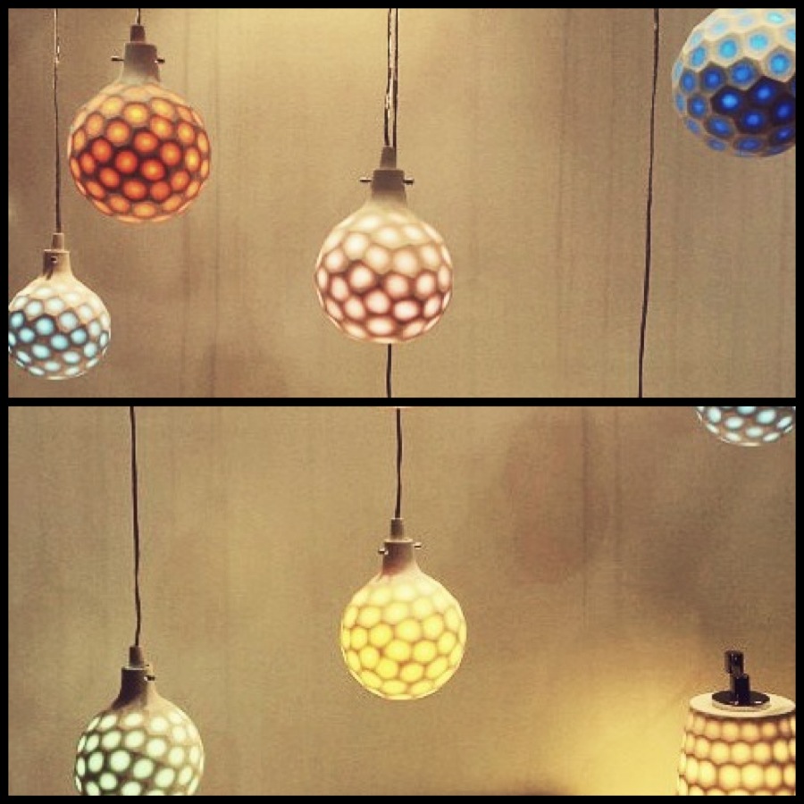
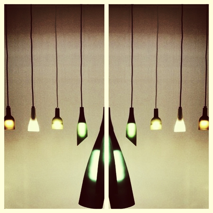
Just a stone’s throw away in Earl’s Court, the grand Exhibition Centre held more eye-catching displays. We particularly liked some of the beautiful lighting design. This, below, is by Korean designer, Ji Hyun Chung:
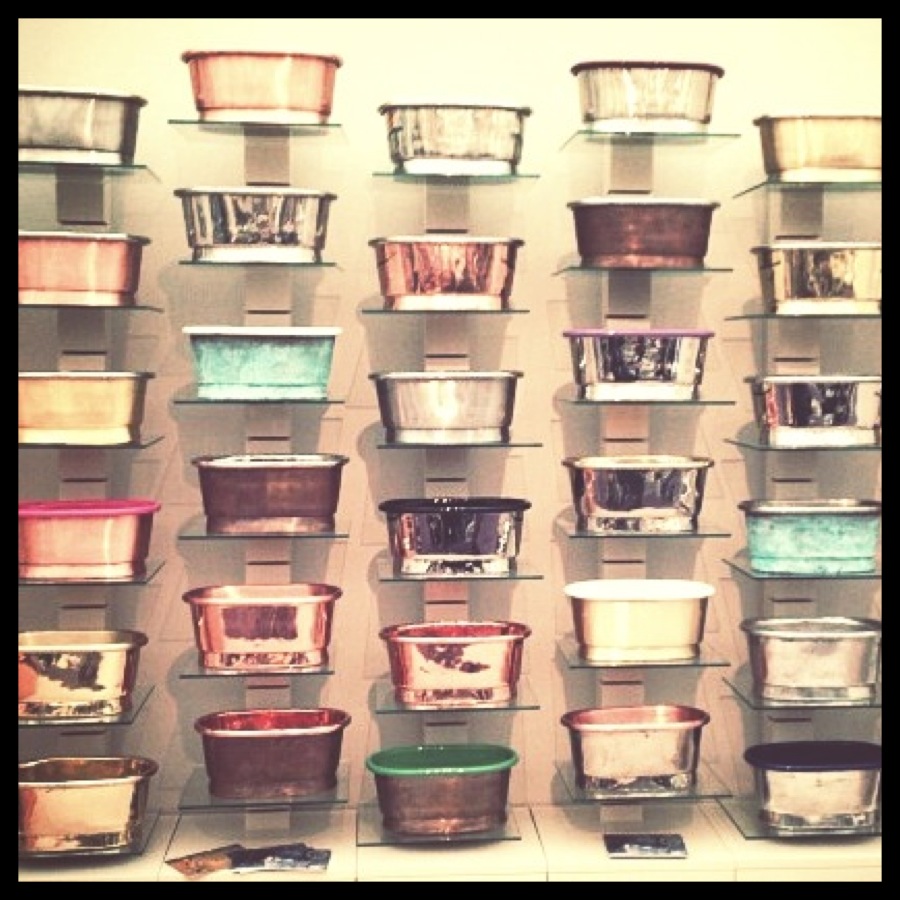
Close by in Kensington, at the Decorex International event, we fell in love with these cute miniature baths:
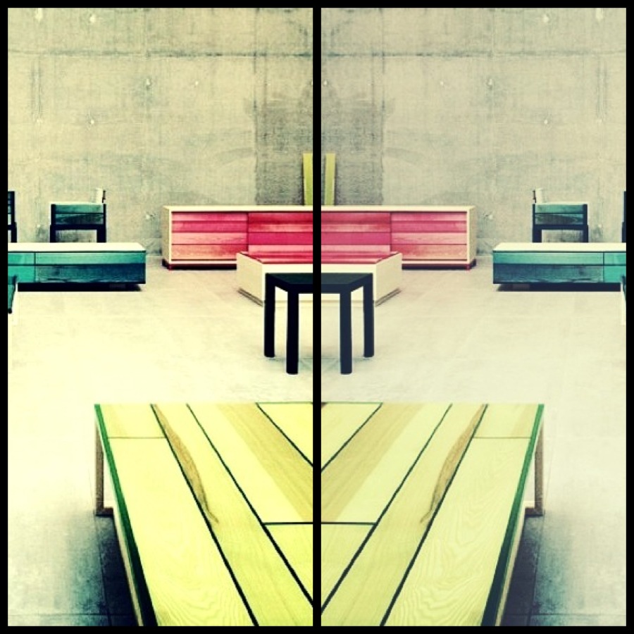
After a little glimpse of West London’s offerings, it was time to head North to see more exhibits. That’s where we stumbled upon this stunning furniture collection created by Japanese architect Jo Nagasaka. Nagasaka developed a range of resin and wood furniture for Established & Sons. His technique involves peeling away parts of the surface of Douglas fir boards to expose the grain, before encasing the wood in brightly coloured epoxy resin. The addition of the resin transforms the uneven texture of the wood into a smooth and practical surface, while variations in the depth of the peeled wood affect the intensity of the resin’s colour. The resulting pieces conveyed a lucid and vibrant finish:
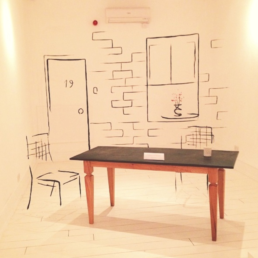
At Design Junction back in Central London, we spotted this great exhibit by Andrea Mancuso as part of “The Analogia Project”. The project conveys an illustration designed specifically for the show space with the aim of challenging spacial representations:
Design Junction also featured some great lighting displays, including this one (below) recycled from waste:
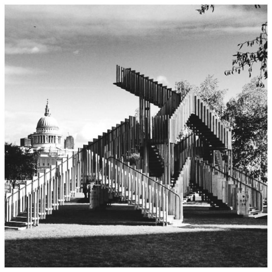
Finally, the piece we couldn’t miss, (and perhaps the pièce de résistance of the London Design Festival), was “Endless Staircase” by dRMM Architects. Taking pride of place next to the Tate Modern and flanked by the backdrop of St Paul’s Cathedral, surely it must be worthy of a permanent addition to London’s skyline?!
Did you visit the London Design Festival this year? Which displays or venues did you enjoy the most? Do you have any predictions for next year’s design trends? We’d love to hear your experiences and see your pictures so please tweet to us @PracticeDigital, and comment on our Facebook page. Don’t forget to check out our Instagram feed too for more photos!


